 ">
"> How To Customize Bootstrap 3 Popovers Individually Using Only CSS!
I was recently tasked with a project that turned out to be rather challenging. I needed to find a way to use Bootstrap popovers as a navigation option as well as be able to style them individually of one another. By default, Bootstrap popovers are style-able but whatever CSS overrides you use will apply to all the popovers, leaving you with only one possible styling scenario. Once again, I needed to make each popover different than the other — style-wise — so I started to do some research.

Styling the Popover
The ability to style the Bootstrap popovers individually proved to be a little more challenging although, in the end, pretty simple actually. I did a few hours worth of research on styling popovers only to be mislead and frustrated. Many other programmers out there were saying to use Javascript or Jquery to pull this off but none of the fiddles or tutorials I found actually worked! And the ones that did really only offered very basic styling of the popover. I wanted full styling freedom!!!
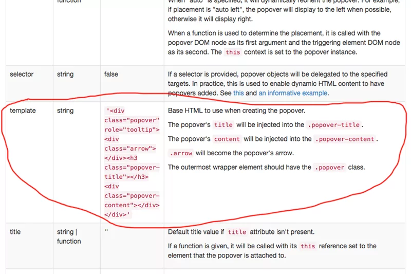
So after being frustrated I went back to Bootstrap’s website to read more documentation on using the popovers when low and behold, Bootstrap (while not actually saying you can) gives you a hint on their site in the popovers section on how you could possibly style them. It’s listed in one of their data attributes and it’s called data-template=””.
So wait a second here… If I can add those HTML attributes to the popover string of HTML… hmmmmmm. Then that means I can rename those classes and style them individually??? Perhaps I can… here’s how:
Just by looking at the above image, you can assume safely that these are the default classes used by Bootstrap to style their popovers. The classes “.popover”, “.arrow”, “.popover-title”, and “.popover-content” are already styled within Bootstrap’s core CSS (which should not be edited but can be overridden in a separate CSS file). And what Bootstrap’s website is telling me here is that I can insert this data-attribute string into my existing popover string like this:
Anyhow, nothing happening yet. All I’ve done is put the standard “template” HTML in the data-attributes section of my code. With a little outside of the box thinking we can start to visualize how we’re going to style these popovers.
So, I have 3 div’s that I’m using as navigation links to trigger these popovers. The code looks like this:
Now we can start manipulating CSS!!!
In order to make this work, we need to do some serious CSS overrides here, so I downloaded Bootstrap’s source code from their download page so I could see the un-minified CSS. I now need to gather all of the CSS relating to the popovers here so I opened the “bootstrap.css” file and searched for “popover” here’s what I found:
Now, I know this looks like a lot of work but here’s the thing, this is ALL of the styling for all of the types of popovers there are. You will not need to change all of this CSS!!! You just need to figure out which classes apply to what you are trying to do. For my example, my popovers are appearing to the left of the triggering div and I am NOT using popover titles AT ALL! Knowing that, I can go ahead and start trimming the fat on my CSS for my custom popovers. After I eliminated all of the bloat that I am not using my CSS now looks like this:
Now, we’re going to actually customize each individual popover by using the classes I made above (popover1, popover2, and popover3) to create three uniquely styled popovers. To do so, we’re going to have to copy the above code and paste it 2 times into our own CSS (and remembering to change the class names) sheet to override the core Bootstrap CSS.
Here is my finalized code with customizations added:
Result:

Following a process such as this, you can create as many individually customized popovers as you wish!!! Just keep repeating the CSS to your styling needs. In order to demonstrate this, I have created a jsfiddle that you can view here:
So, depending on your CSS skills at this point, the sky is the limit as far as styling these popovers. I have only scratched the surface here. No javascript necessary, all CSS and seems to work very well to me. I hope you found this article helpful and informative and as always, I look forward to your comments 🙂
You literally answered your own question. Popovers are not meant for large amounts of data. Use another bootstrap feature like a modal or create your own content areas that are large enough for your content. You’ll have to think outside the box with this one, but I would start with changing the CSS you see above to make the boxes large enough to contain your content perhaps? 😉
Pingback:
Thanks for pointing that out Filipe! I must have deleted it by accident. I have restored it on JSFiddle so click the link again and you can see it in action. I also realized that this only works with Bootstrap Ver: 3.2, newer versions of Bootstrap will need tweaking as — well — things have changed between now and then. Thanks again 😀
Leave a Comment Below...